TOP 6 Best Restaurants Websites with Stunning UI/UX Design
If you are looking for some inspiration for your restaurant website project, you have come to the right place. In this post, we will showcase six of the best restaurant websites that have amazing UI/UX design. These websites not only look great, but also offer a smooth and engaging user experience that makes visitors want to book a table, order online, or explore the menu.

Introduction
In today's digital age, a restaurant's website is more important than ever. It's often the first thing potential customers see, and it can make or break their decision to dine there. A well-designed website can help create a positive first impression, showcase a restaurant's unique offerings, and make it easy for customers to book a table.
Whether you're a new restaurant owner or looking to update an existing website, these examples will help inspire you to create a website that will wow your customers and help you grow your business.
So without further ado, let's take a look at what we think are the top six restaurant websites with stunning UI/UX design!
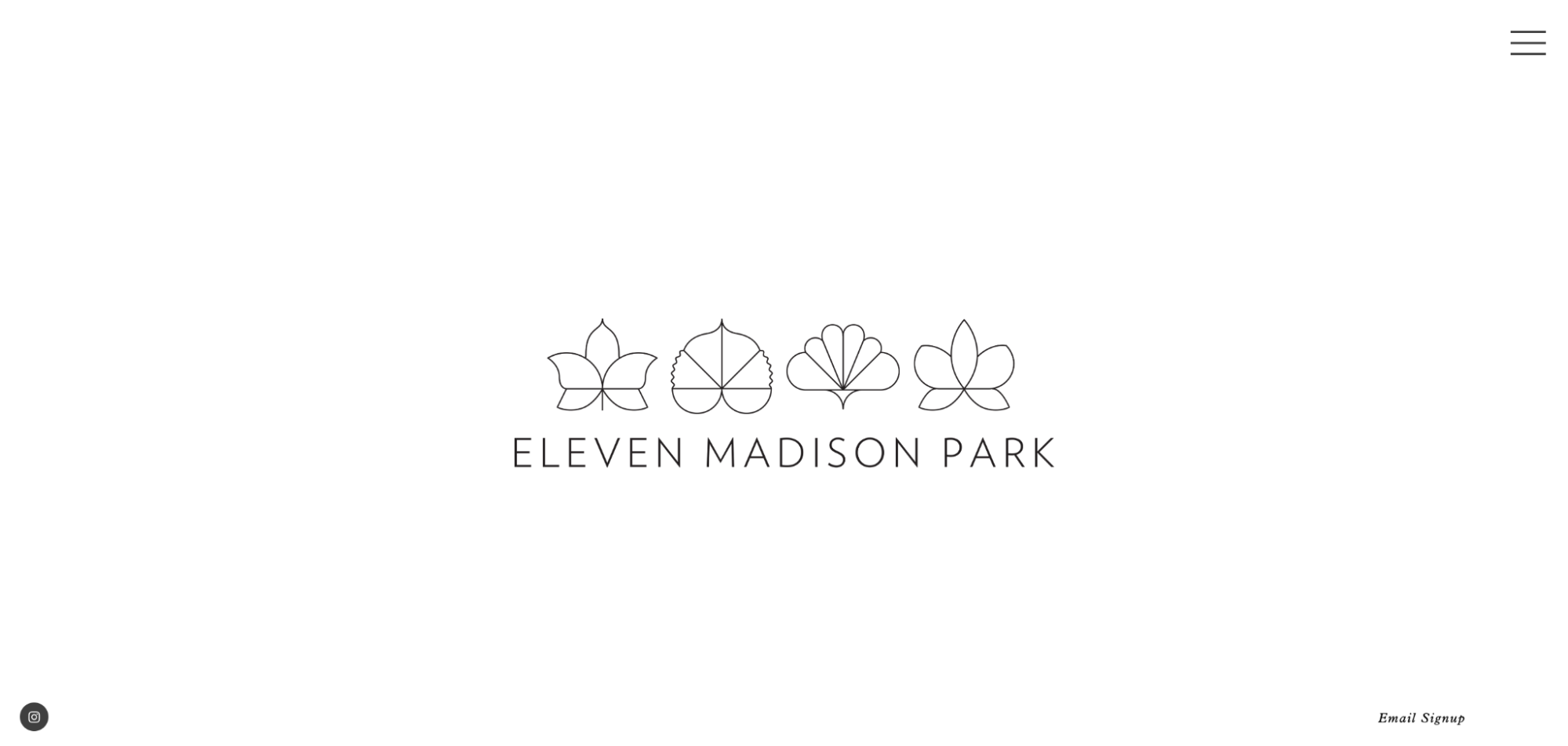
Eleven Madison Park is a fine dining restaurant located in New York City. The restaurant has a plant-based menu that showcases seasonal and local ingredients in creative and delicious dishes.
The website of Eleven Madison Park reflects its elegant and sophisticated style, with a simple and minimalist design that highlights the stunning photos of the food and the restaurant. The web page has a clear and easy-to-navigate layout, with sections for reservations, menus, stories, press, cookbooks, gifts, teams, events, and frequently asked questions. Also uses a neutral color palette of white, black, and gray, with pops of green and gold to accentuate the logo and the photos. It has a responsive design that adapts to different screen sizes and devices. The web page of Eleven Madison Park is a great example of how to create a professional and attractive online presence for a restaurant.
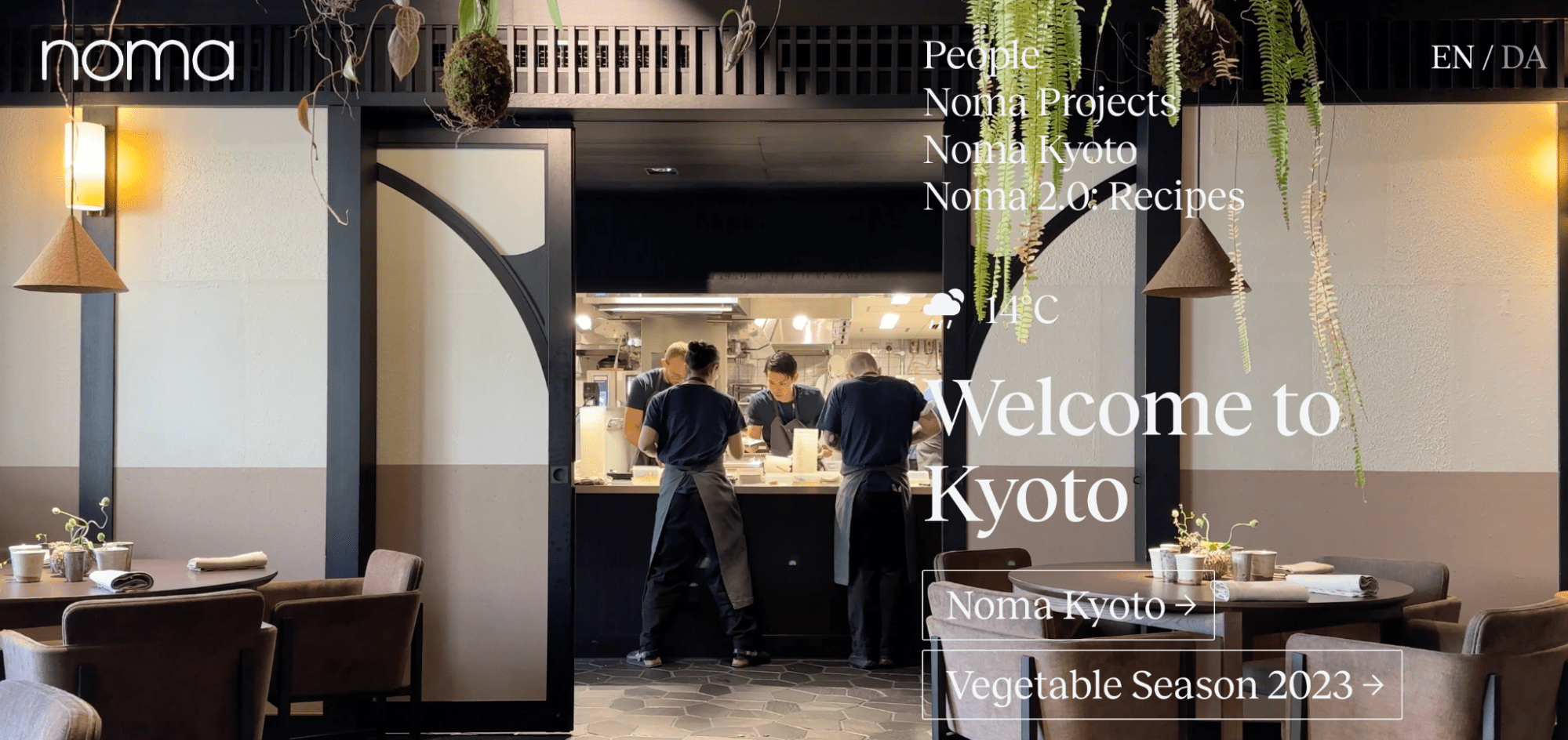
Noma is a world-renowned restaurant in Copenhagen, Denmark, that offers seasonal menus based on local ingredients and innovative techniques.
The website of Noma reflects its philosophy of creativity, simplicity, and elegance. The homepage features a stunning video of the restaurant's surroundings and dishes, as well as a clear navigation bar with options to book a table, learn more about Noma, or explore its online shop. There uses a minimalist design with white backgrounds, black fonts, and subtle animations. The web page also showcases Noma's stories, events, recipes, and collaborations through engaging articles and images. And of course, it's responsive and easy to use on different devices and browsers.
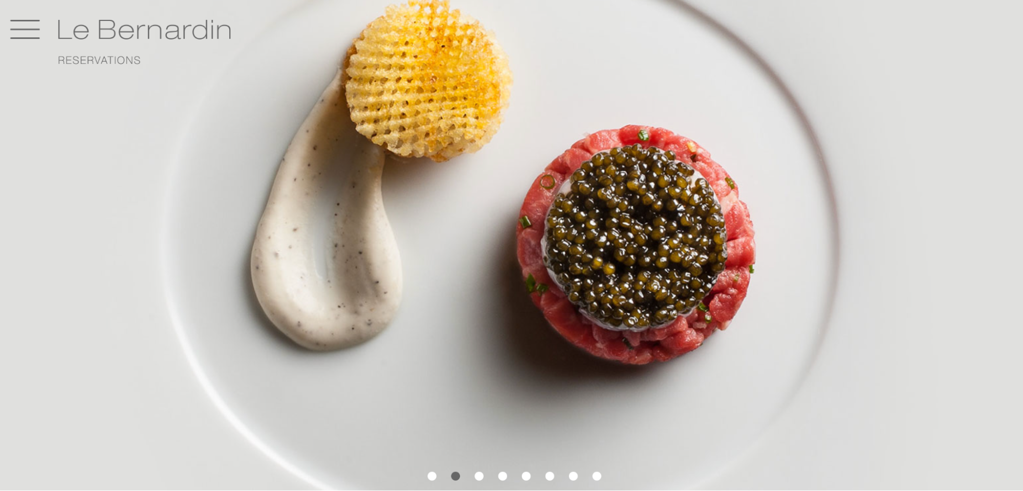
Le Bernardin is a seafood restaurant in New York City. It has been awarded three Michelin stars.
The website of Le Bernardin reflects a sophisticated style, with a minimalism that showcases the quality of the food and the service. The creators use a black and white color scheme, with accents of gold and red for contrast and warmth. The homepage features a full-screen video of the restaurant's interior, with a simple navigation menu in the top right corner. The menu allows users to access information about the restaurant's history, menus, reservations, private dining, gift cards, and contact details.
We can see responsive and adapts to different screen sizes and devices. It also has a high level of accessibility, with clear fonts, contrast ratios, and keyboard navigation. The page is fast and easy to use, with smooth transitions and animations. Also present integrates social media links and reviews.
The Le Bernardin website is a great example of how to create a user-friendly and attractive online presence for a high-end restaurant.
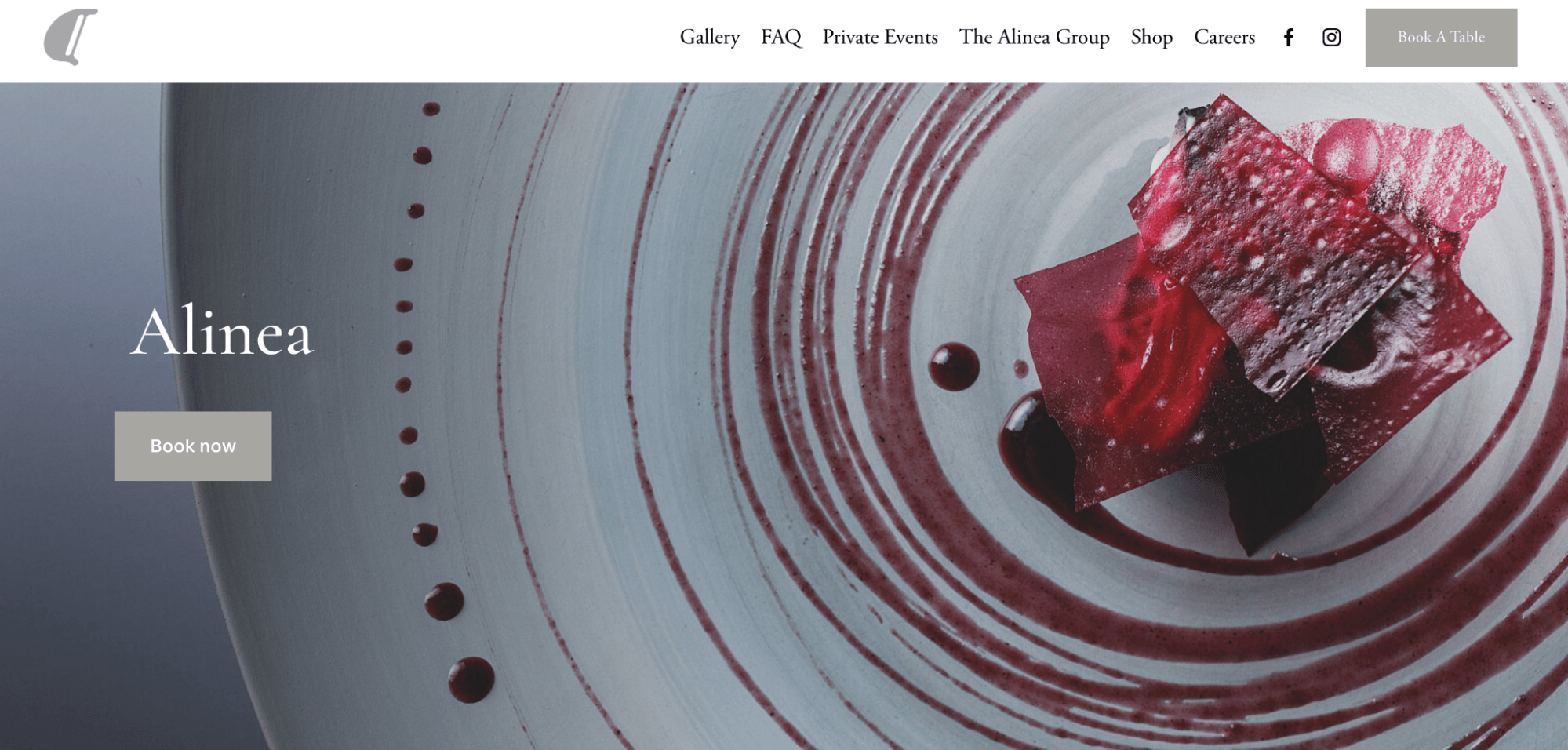
Alinea is a three-Michelin-starred restaurant in Chicago that offers a unique and innovative dining experience. The website of Alinea reflects its creative and modern approach to cuisine, with a sleek and minimalist design that showcases the dishes and the chefs. We can see a great color scheme, with white, gray, and red for accents and buttons. The homepage features a full-screen video of the kitchen and the dining room, with a simple navigation menu in the top right corner. The web page also has sections for reservations, menus, gift cards, events, and contact information. This page aims to create a sense of curiosity and excitement for the visitors and to convey the high quality and originality of Alinea's food and service.
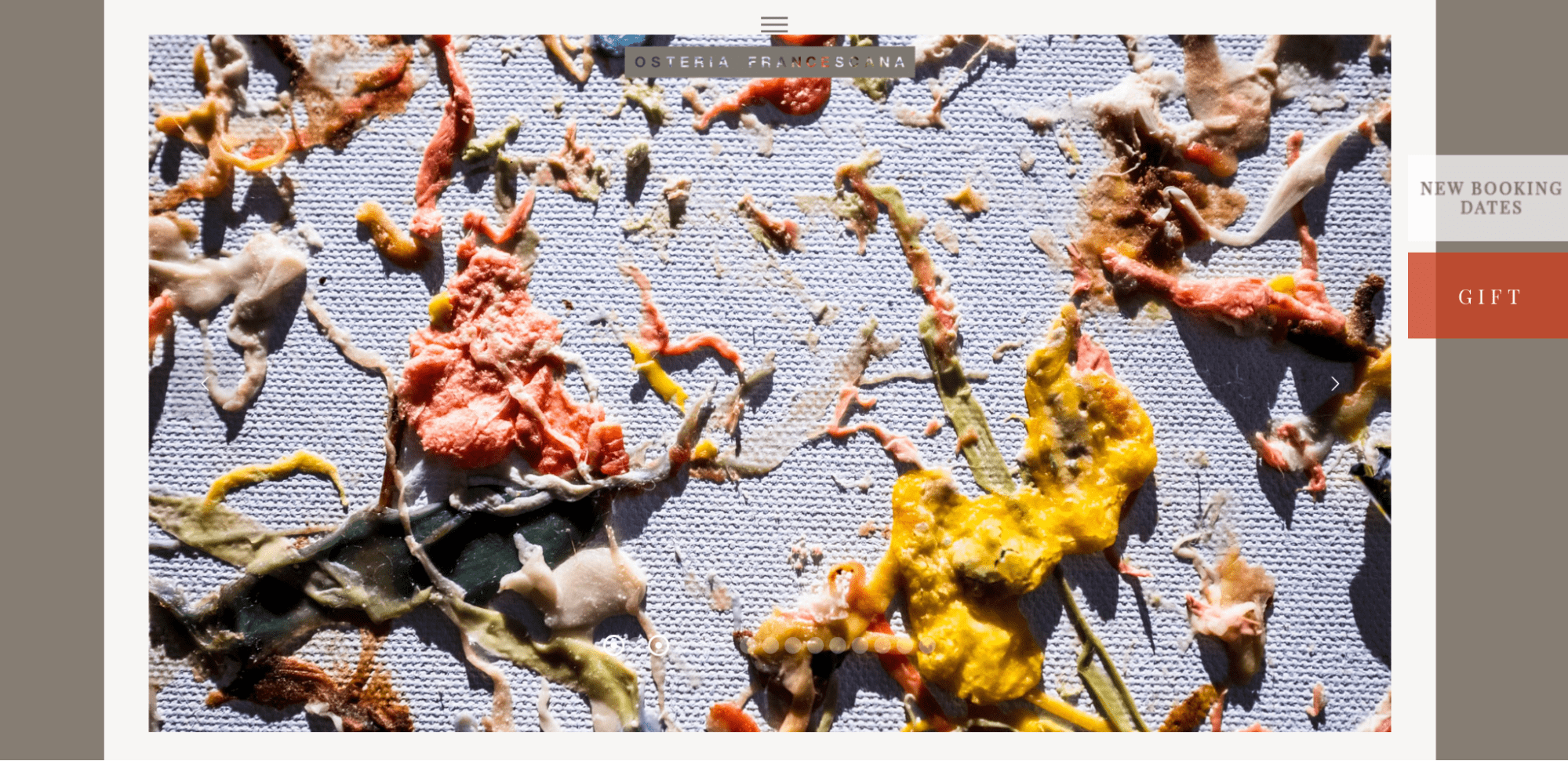
Osteria Francescana is a restaurant in Modena, Italy, that offers a creative and contemporary interpretation of Italian cuisine.
The restaurant's website reflects its vision and values, with a minimalist and elegant design that showcases the dishes, the chef, and the awards. The usual colors for 3 Michelin stars - are black and white, with pops of red and gold for contrast and emphasis. The navigation menu is simple and intuitive, with options for home, menu, reservations, contact, and press. The homepage features a full-screen video of the chef preparing a signature dish, with a catchy slogan and a call to action button. The website is responsive and adapts to different screen sizes and devices. In this case, also uses subtle animations and transitions to create a dynamic and engaging user experience.
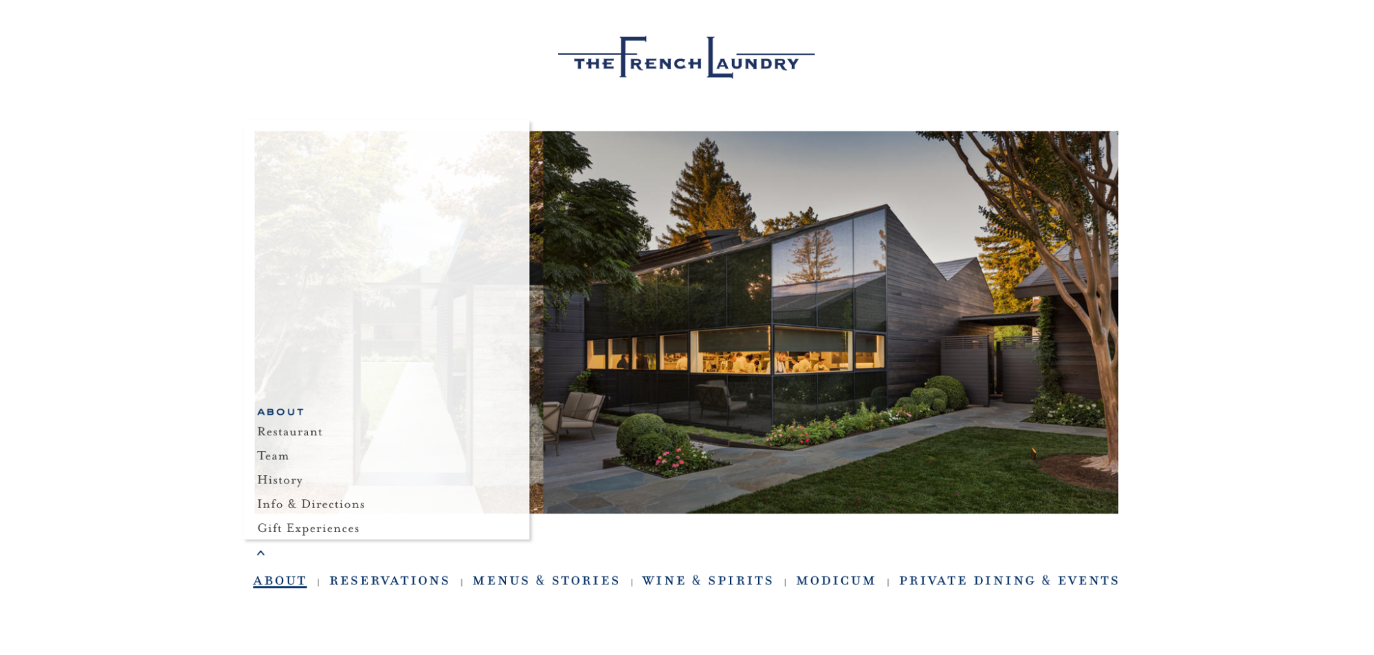
The French Laundry in Yountville, California, offers a seasonal tasting menu of French cuisine with local ingredients. The restaurant's website expresses its elegant and refined style, with a simple and intuitive layout that showcases the food and the history of the place.
The restaurant uses a white and gold color scheme, with a serif font for the headings and a sans-serif font for the body text. The website has four main sections: Home, Menu, Reservations, and Contact. The Home section features a slideshow of high-quality images of the dishes and the restaurant, with a brief introduction and a link to the Menu section. The Menu section displays the current tasting menu and the wine list. The Reservations section allows the user to book a table online or by phone, with information on the availability, the cancellation policy, and the dress code. The Contact section provides all necessary information and links to its social media accounts. The author of this blog was impressed by the website of this restaurant with its simplicity and elegance at the same time.
Conclusion
In conclusion, UI/UX design is an essential aspect of creating a successful restaurant website. A good UI/UX design can attract more customers, increase conversions, and enhance the brand image of the restaurant. Some of the best practices for UI/UX design for restaurant websites are: using high-quality images and videos, providing clear and easy navigation, offering online ordering and reservation options, displaying customer reviews and testimonials, and optimizing the website for mobile devices. I hope that by using all these tips you will impress the visitors to your restaurant website. If you still have doubts about what your website should look like, contact the professionals of HQWS.